Boots Pharmacy Order Tracking:
A 5 Day Sprint to Clarity
Project Background
Sprint goal: Provide a reliable, frictionless order visibility and fulfilment experience for pharmacy customers.
Team: UX Lead, 2 Researchers, 1 UX Designer.
Format: 5 days, collaborative in Figma (Figjam), remote friendly.
Audience: Pharmacy customers tracking orders from purchase through fulfilment/collection/delivery.
Success signals: Reduced customer uncertainty and support contacts; clear status language; quicker problem resolution.
My Roles & Responsibilities
As the UX Lead for this project, I was in charge of:
Resourcing the appropriate team.
Aligning with stakeholders on the intent of the Design Sprint.
Plan and facilitate the sprint schedule.
Facilitated interviews and mapping; aligned the team on the sprint goal and target slice.
Coached the team on structured sketching; pushed for clear status copy and accessibility.
Facilitated decisions; wrote the initial copy for status states and error/resolution messaging.
Led the prototyping, ensured accessibility basics (contrast, semantic structure), and rehearsed the flow with the team.
Drove synthesis, framed recommendations, and converted findings into a phased delivery plan.
Day 1
Understand and map the mess
The objective of the session was to align on the problem we were trying to solve and define a clear sprint target. We also mapped the end-to-end journey to identify key risk areas, uncover opportunity hotspots, and ensure the team had a shared understanding of where to focus.
My role was to run the room, align on the goal and keep scope tight.
WHAT WE DID
Expert interviews (ops, pharmacy, support) to learn the constraints, policies and weird edge cases.
Defined what “order visibility” actually means for pharmacy (prescriptions, split orders, delays, etc.).
Journey mapped from: Order → Payment/Auth → Fulfilment → Status updates → Pickup/Delivery → Help.
HMW notes captured in Figjam to translate pain points into opportunities.
Sprint questions & top risks (e.g., unclear status language, split orders, compliance messaging).
OUTPUTS
Target areas for the sprint (e.g., “Status tracking & notifications for in-flight orders”).
Prioritised HMW clusters.
Risks & assumptions list to test by Friday.
Day 2
EXPLORE OPTIONS (Inspire & Sketch)
The objective was to explore a wide solution space and turn the insights gathered into clear, tangible ideas that could be developed, compared, and tested quickly during the sprint.
My role was to coach sketching, push for quality copywriting and advocate for ideas with accessibility in mind.
what we did
Lightning demos: quick reviews of exemplary tracking/notification patterns across retail & logistics.
Notes → ideas → Crazy 8s; everyone sketched different ways to explain status, delays, and split orders.
Concept sketches (3 to 5 end-to-end flows) annotated with copy, triggers, and data states.
Drafted testable hypotheses, e.g., “If customers see a single timeline with plain English statuses, they will feel more in control and contact support less.”
OUTPUTs
3 to 4 promising concept directions.
Shortlist of patterns (timeline view, proactive alerts, escalation path, store handoff QR codes).
Day 3
DECIDE & STORYBOARD
The objective for this stage was to select one clear concept and shape it into a realistic prototype that could answer the key sprint questions.
My role was to help unblock decisions, keep the team focused on the strongest direction, and draft the first version of the status copy, including error messages (unhappy paths) and resolution text, so the prototype felt clear and realistic enough to test.
what we did
Zoom in on sketches to identify strongest moments.
Combined strongest elements into one flow using a fast impact/effort check.
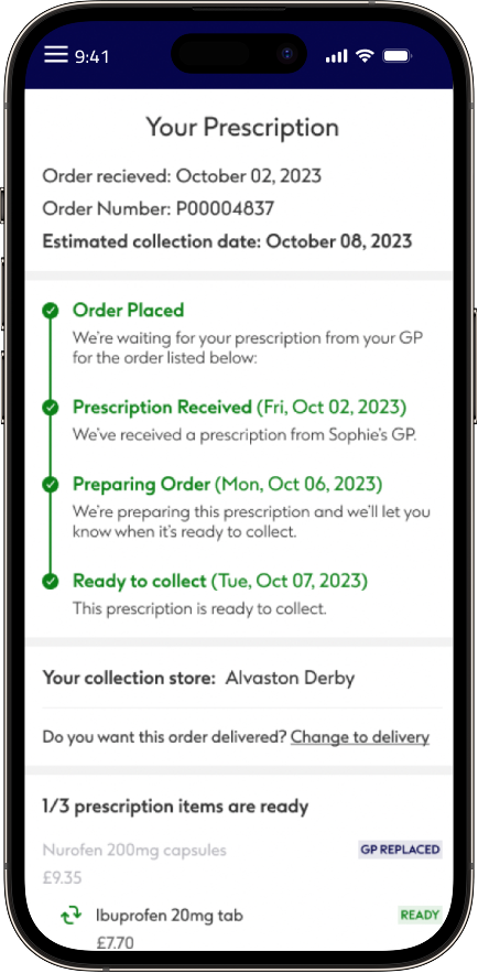
Built an 8 to 10 frame storyboard. Overview → timeline → delay scenario → split order → notification settings → pickup/delivery handoff → help.
Defined content & states: ordered, ready for fulfilment, delayed, partial fulfilment, ready to collect/deliver, issue flagged.
OUTPUTs
Signed off storyboard with copy placeholders.
Prototype scope & data/state checklist.
Usability test plan and script outline.
Day 4
prototype (make it real)
The objective for this stage was to build a believable end-to-end experience and prepare a test that would help us validate the key sprint questions.
I co-designed the prototype, checked the basic accessibility considerations, and rehearsed the walkthrough with the team to make sure the experience felt realistic, clear, and ready to put in front of users.
what we did
Mid to high fidelity Figma prototype, mobile first with responsive considerations.
Microcopy & content design for statuses, delays, split orders, and escalations.
Built variant states (happy path, delays and split fulfilment journeys) to probe comprehension.
Finalised moderated testing script with 5 realistic tasks (find order status, interpret a delay, manage notifications, handle split fulfilment, get help).
Researchers recruited 5 target customers and prepared note taking templates (rainbow spreadsheet + affinity board).
OUTPUTs
Clickable prototype covering priority scenarios.
Test materials: screener, consent, script, tasks sheet, success criteria.
Day 5
test, Learn & prioritise
The objective for this stage was to validate whether the concept felt desirable, clear, and useful to customers, while identifying any changes needed before moving towards delivery.
I drove the synthesis of the research findings, helped frame the key recommendations, and turned the insights into a phased delivery plan that gave the team a clear path forward.
what we did
5 moderated usability sessions run by the researchers, with live note taking in Figjam.
Captured quant and qual: task success/time, confidence ratings, verbatim quotes.
Affinity mapping to cluster observations into themes; prioritised with a severity/impact scale.
Playback & recommendations to stakeholders.
KEY INSIGHTS
User testing showed that the prescription tracking service was generally well received, particularly the clear progress tracker, simple layout, and SMS links to order status. However, participants highlighted several areas that need improvement before delivery. The biggest issues were around transparency, with users frustrated that unavailable items, delivery costs, and next steps were not always clear upfront. There was also resistance to account creation, especially when users felt essential tracking information should be available without logging in. Communication was another key theme, with users wanting proactive SMS and email updates when problems occur, clearer explanations of prescription statuses, and GP contact details where their intervention may be needed. Delivery and collection options were valued, but users needed more clarity around partial fulfilment, collection logistics, and cost.
Decisions & Next Steps
The next step was to iterate the copy and information hierarchy while keeping the single timeline pattern as the core experience. We recommended adding explicit delay reasons and resolution ETAs wherever the data was available, helping users understand what had happened and what to expect next. For delivery, we proposed a phase-one MVP focused on the order overview, timeline, and basic notifications, with store-handoff enhancements added to the backlog for a later phase. Post-launch, success would be measured through support contact rate, NPS/CSAT for the order experience, time-to-clarity, and task success in analytics.