Booking Flight App
Overview
Researching and prototyping an airline mobile phone app that showcases the most efficient way for an individual to book and pay for a flight.
Responsibilities
User testing, research, wireframing and prototyping.
Year
2018
Location
Remote (Glasgow)
About
Fly UX was my UX diploma project. The assignment was to utilise UX research disciplines to produce an airline app prototype.
The Objective
The task was to thoroughly research airline booking apps. Collect data and build wireframes and prototypes based on the data collected from the research.
The Team
I was the UX researcher and prototype designer for this project.
Process
Since development had already begun when I arrived, some compromises and limitations had to be considered.
Research
Wireframe
Prototype
Research
My goal was to understand the benchmark for an airline app also analyse the way users interact with such products on data to day basis.

Competitor research and
benchmarking
I began by familiarising myself with some of the most popular travel apps that users were most accustomed to.
Competitor User Testing
To further my benchmark research, I began user testing popular flight booking apps. The first test was for the user to book through a well established international airline. The users found this process very straightforward and efficient. As mundane as the UI was, they seem to merit the fact that it was simple which meant they could always trust the process.
The second user test was to a flight for a group on a low budget continental flight. At first glance, the users voiced that the app provided too much information. They were created with multiple offers which left them confused on how o begin their booking process.
As they progressed through their booking they were presented with multiple offers at each turn. By the time they finished their booking process, there was self-doubt about what they had done and if they had made the right decisions.

In-depth User Interview
To get more in-depth data and further information I held a user interview with a frequent flyer who travels around the world and is familiar with multiple booking formats. I was looking to learn about affordances the user would expect and common scenarios the user would be booking flights in.
The results were very interesting and brought attention to issues like security, trust-building and data protection I had not yet considered.
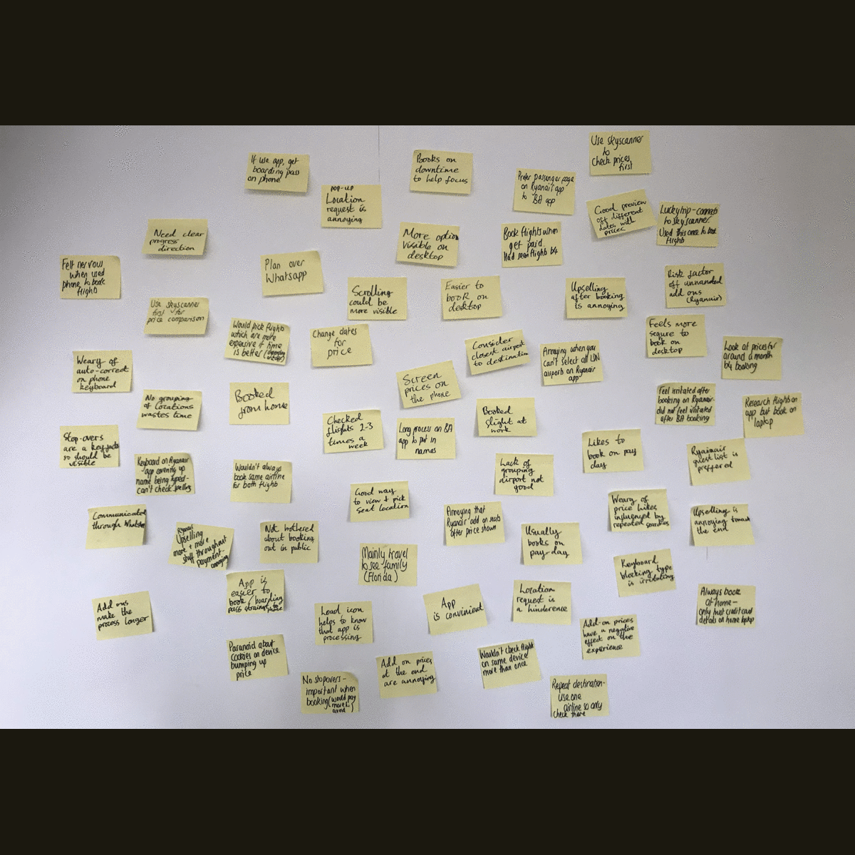
Card Sorting and Affinity Diagrams
Combining the information acquired from the user tests and interviews, I began card sorting the information and building an affinity diagram.
I categorised the reoccurring points of interest as for early flow creation purposes.
The categories I came up with were:
Planning
Research
Booking
General app feel
Positive user comments
Negative user comments
Closing experience
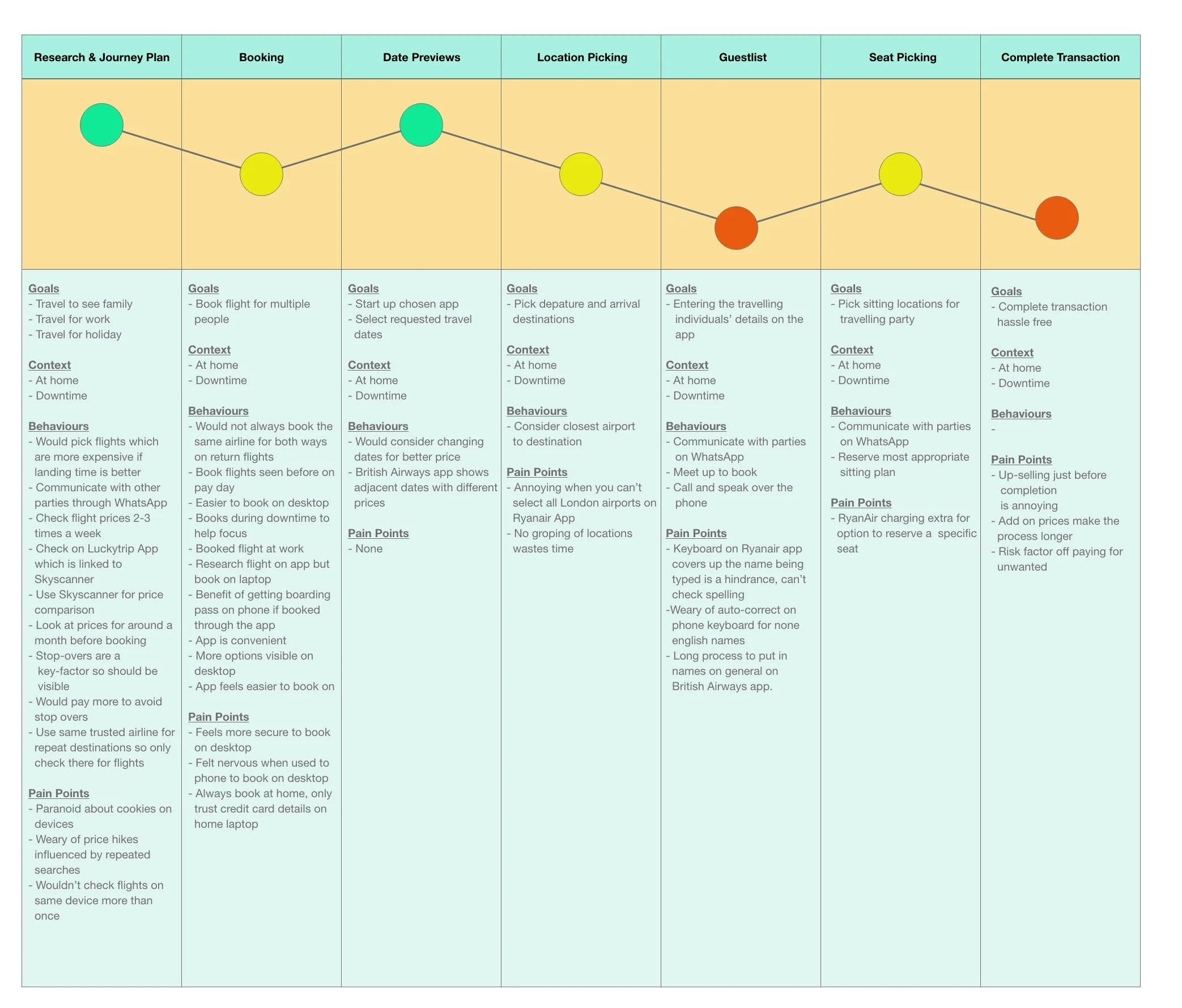
Customer Journey Map
Creating a customer journey map helped to analyse some key factors within the end to end process of the booking flow. With the research data gathered, I was able to point out exact moments that needed the most attention to amplify the end to end experience.
Problem Framing
Communication
Most feedback from the users was entered around making sure they had made the right decisions. This meant that the flow needed to be clear and concise.
Priorities
The Usability Tests indicated that the app needed to be straightforward. This meant that the call to actions needed to be prominent and give a clear direction of what their intention was.
Security
The users needed to also feel safe which meant having a reminder of how secure the app was with their data.
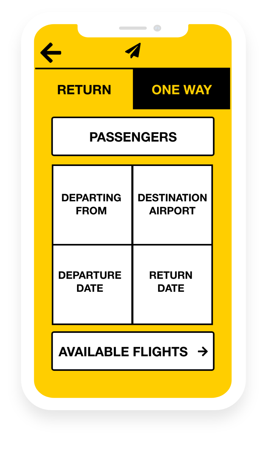
Wireframe
Now that the initial research phase was complete, I gathered all the information I had collected
over the past weeks and began mocking up wireframes and design systems.
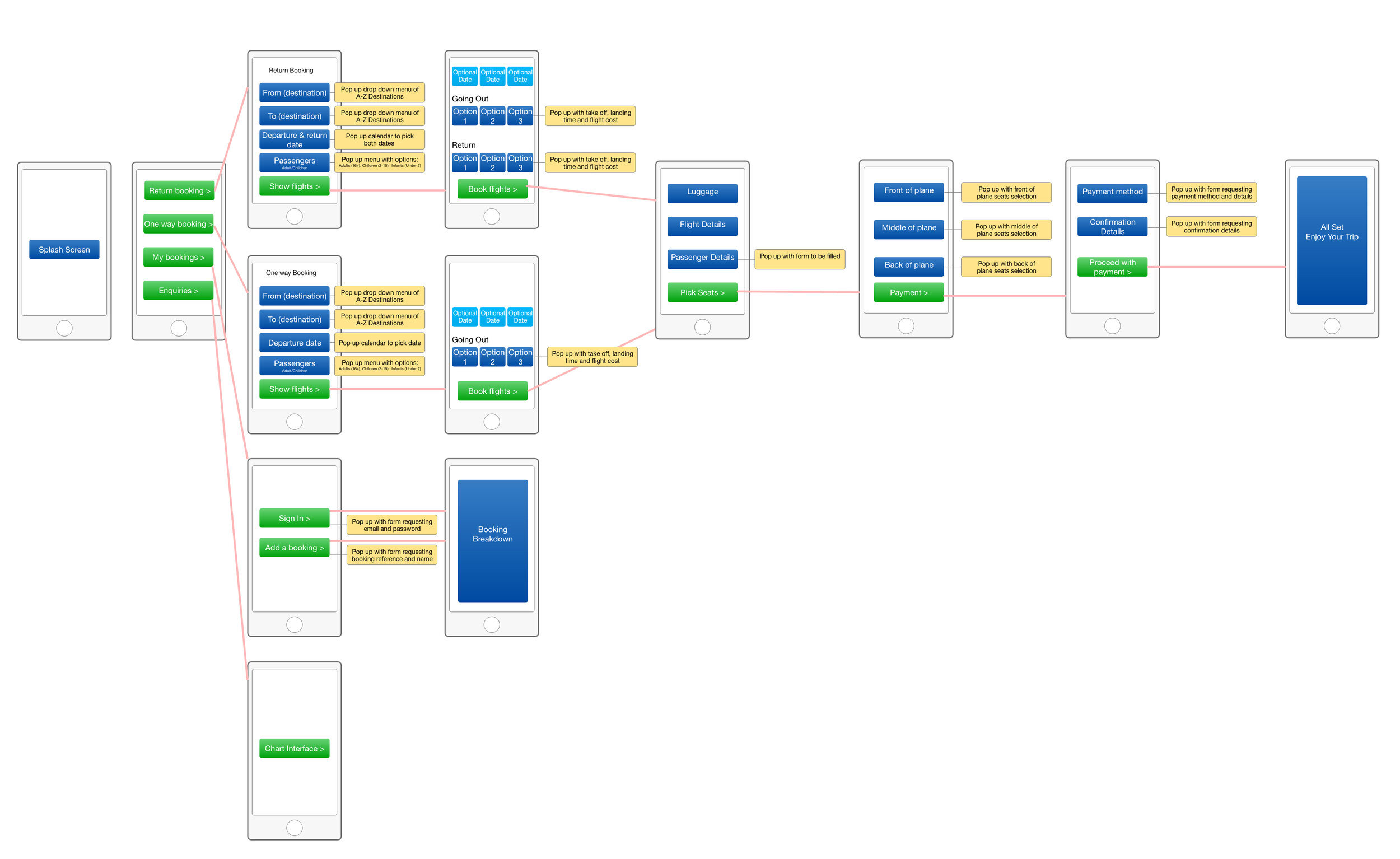
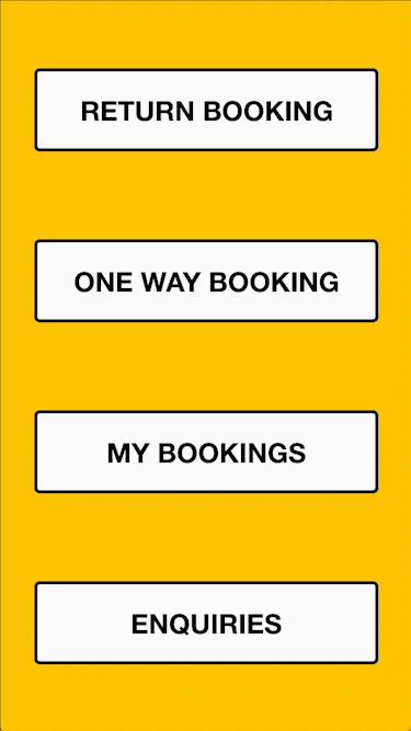
Mobile App Booking Flow
I began creating a simple flow for the booking process. The purpose of this was to clearly understand the end to end goal for this process. This is very beneficial as it helps clarify and prioritise the whole user journey.
Design Systems
This is where I began to go more into depth with the layout and wireframe of the app. This process gave the app structure and allowed me to add the necessary details and functionality.
Most of the systems were taken from affordances that I had noticed in the research. Instead of trying to re-invent the wheel, I chose assets that most users are familiar with and already accustomed to.

Interaction and Functionality
I began defining the interactions and functionality of the systems. By adding these annotations, the design became easier for the development team to understand its functionalities.
Having these annotated wireframes also help the wider team understand the complete app at a much earlier stage to avoid costly iterations at a much costly stage of the building process.
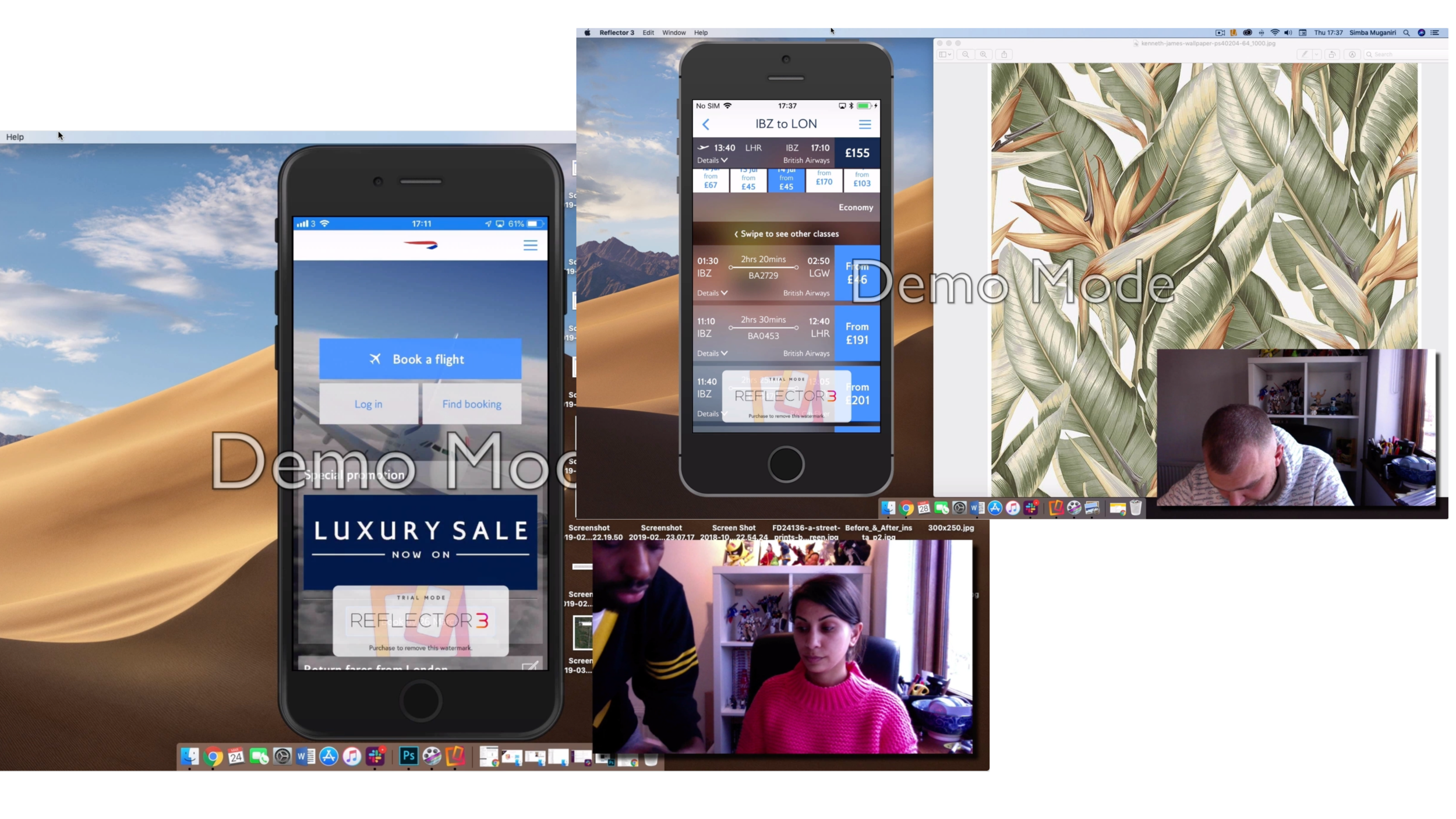
Prototype
With the wireframe structure and functionalities clearly defined, I moved on to the prototype phase.
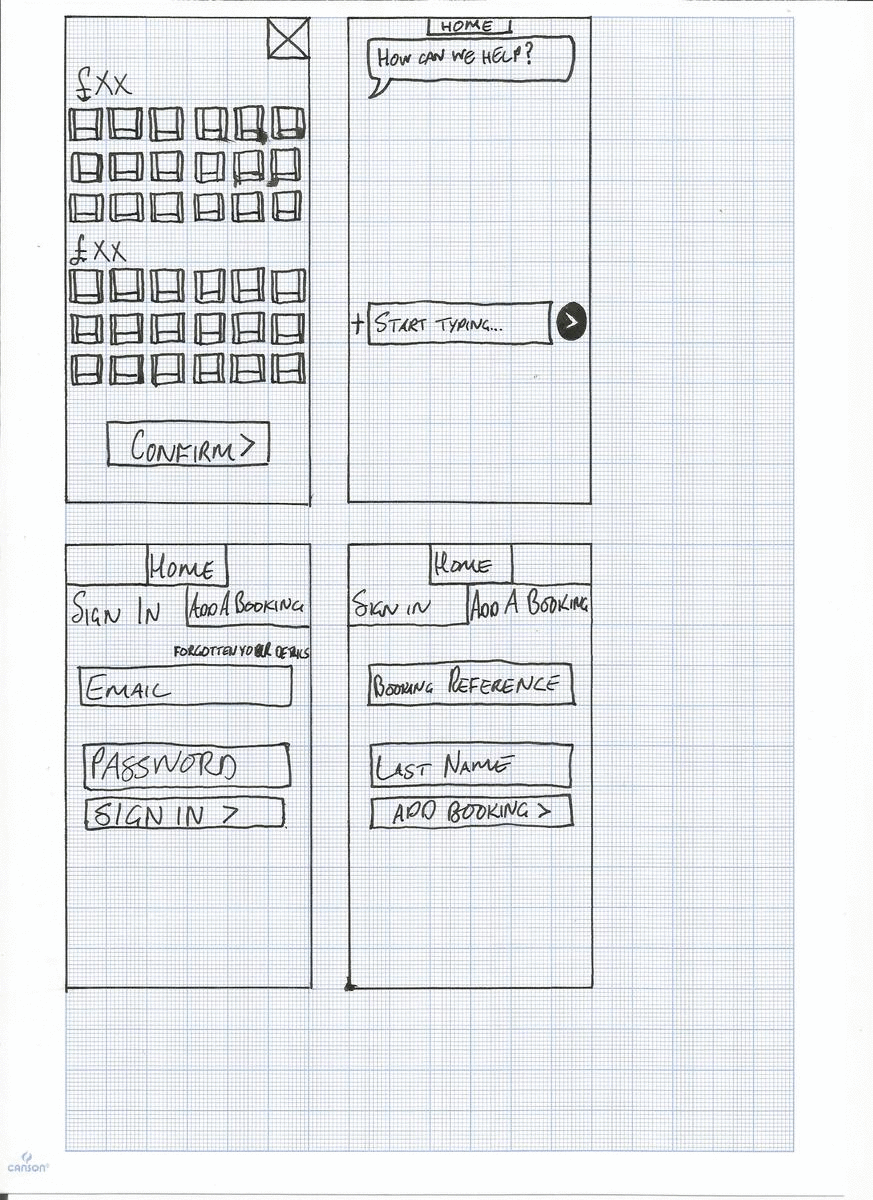
Low Fidelity Prototype
The prototype was designed at a basic level without too many UI aesthetics. Building this was very straightforward considering the previous wireframes. This prototype was built solely in Adobe XD with the assistants of UI kits.
When testing the prototype, a few more points came to light. The design needed to consider mobile keyboards and how the final UI should be structured to avoid user complications. The prototype was built with accessibility in mind with clear call to action assets that the users would be easy to recognise.
Conclusion
I learnt a lot about researching for design. I learnt that thorough research and intuitive UI go hand in hand to produce a good user experience.
Reflect
The key factor with this project like all UX projects was the research. The project gave me a chance to explore different methods of research. I had more time to dive deeper with a range of users with different perspectives and experiences with the subject matter.
Challenges
The main challenge was organising user tests considering the amount of time that was needed to conduct one. The tests were held as personal favours but in the future, I would consider offering a paid rate as an incentive to acquire more users.
Future Planning
This project taught me a lot about how important the research process is to the UX process as a whole. What users say and do are different, observing users manoeuvre around in the app is very informative and insightful and a lot of unnecessary obstacles can be avoided this way.