MHR
Overview
Improving and innovating a Finance, HR & Payroll product to be more user-friendly for administrative and workforce users across multiple job sectors.
Responsibilities
Journey mapping, research, user interviews, wireframing, UI design, and prototyping
Year
2022 (Jan-Oct)
Location
Nottingham
About
MHR is a tech firm that provides HR, Payroll, and finance products to over 1400 companies from SMEs to large global corporate entities.
The Problem
HR has expanded to be a role that requires individuals to be responsible for more than one specific duty. HR admins are now taking on recruitment, onboarding, training, correspondence management, payroll, and general people management. We set out to define a solution for HR admins to be able to multitask across their ever-growing daily tasks.
The Team
On this particular project, I was the Senior UX Designer in a team that included a Product Owner, a Business Analyst, and a Junior UX designer who assisted in the UI and research for the project.
Process
The majority of the functionality and features already existed in the platform however they did not work concurrently which meant laborious user journeys.
User interviews
Ideation
UI Design & Prototype
User interviews
To address this challenge, I conducted user research, including interviews and usability tests, to gain insights into the workflows, pain points, and user preferences of HR professionals.
Customer panels
We started by hosting customer panels with existing users to better understand the most valuable features of the existing platform. We also needed to understand how the HR Admins worked in their day-to-day. One of the key things we quickly realized was that a lot of time was spent exporting data from the platform into Excel spreadsheets. They expressed that spreadsheets work as a good visual aid for data across multiple channels and an affordance when file sharing. There were still some pain points when it came to automation and data transferring across channels.
Navigation
Easier and more accessible navigation was going to be key in providing efficiency for admins. We needed to include affordances within the app that the users felt were familiar and that they could confidently transfer their already known knowledge to.
Problem framing
Most of the feedback was about task assignments and handovers which were all centred around people management. In most cases, if an HR admin was absent, it was difficult to keep track of their ongoing responsibilities and cases. This was a result of how widespread the responsibilities were for admins. A task manager with handover features was necessary.
Language
We also had conversations about the type of language that was most common amongst HR admins. I consulted with internal admins to see if they would understand some of the language we were using and what the expected behavior was when they engaged with functionalities.
Ideation
After reviewing the research, we created a more tactical objective which we agreed upon with the key stakeholders.
Journey mapping
We started looking at the existing features we already had in the platform and considered how we could combine them to make more considerate user journeys.
We studied the features to see how we could combine and improve them for efficiency and easier navigation.
One request from the stakeholders was a people management feature that would assist in employee finding, job transfers, and general management. We realized that the layout and structure we were after were similar to that of the existing comparison view which was also requested to be in the HR app. The comparison view already had some functionality we could use for people management so we treated it like a base layer.
Feature conceptualisation
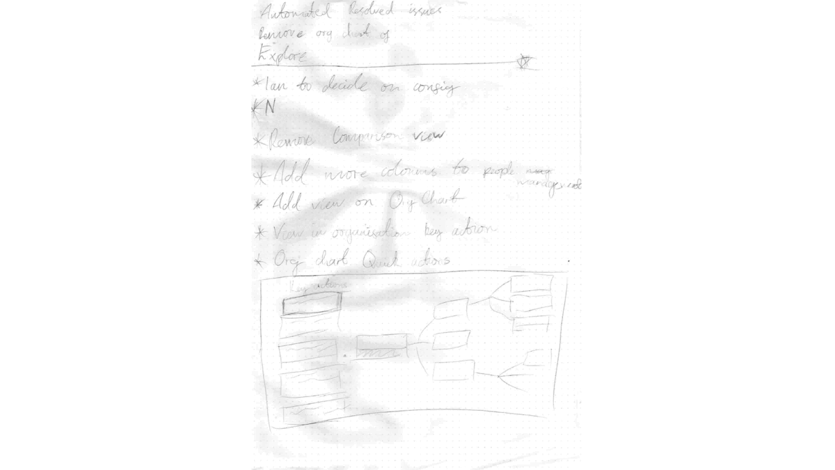
To efficiently understand some of the behaviors, I rapidly sketched a lot of the ideas that were being discussed with what I thought would be the best user-friendly solution. This helped in getting everyone to understand the functionality and signing it off without investing too much much time.
The HRM app (Human Resource Management) was going to consist of a lot of features that were owned by different departments, this meant I had to consult with other Product Owners, Researchers, and UX Designers for any updates and findings on their current features. This collaboration helped me better understand certain functionalities and why they were the way they were. This was also exciting for the wider teams as it gave them a chance to push more innovative ideas they had in their backlogs.
The concepts included ideas such as task management, organisation chart navigation, profiling, and table management.
UI & Prototyping
Throughout the project, my primary objective was to design a software interface that would empower HR teams to effectively manage employee data, track performance, handle leave requests, and facilitate seamless communication within the organisation. I collaborated closely with stakeholders, including HR managers and developers, to gather requirements, understand pain points, and align design goals with the software's purpose.

Navigation
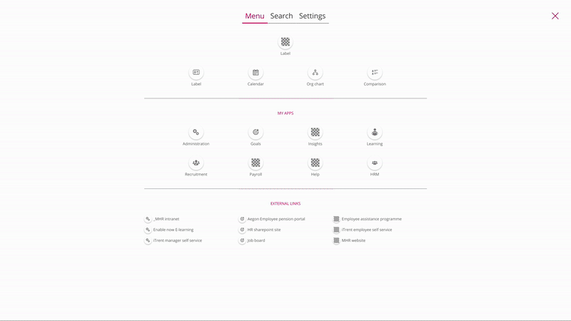
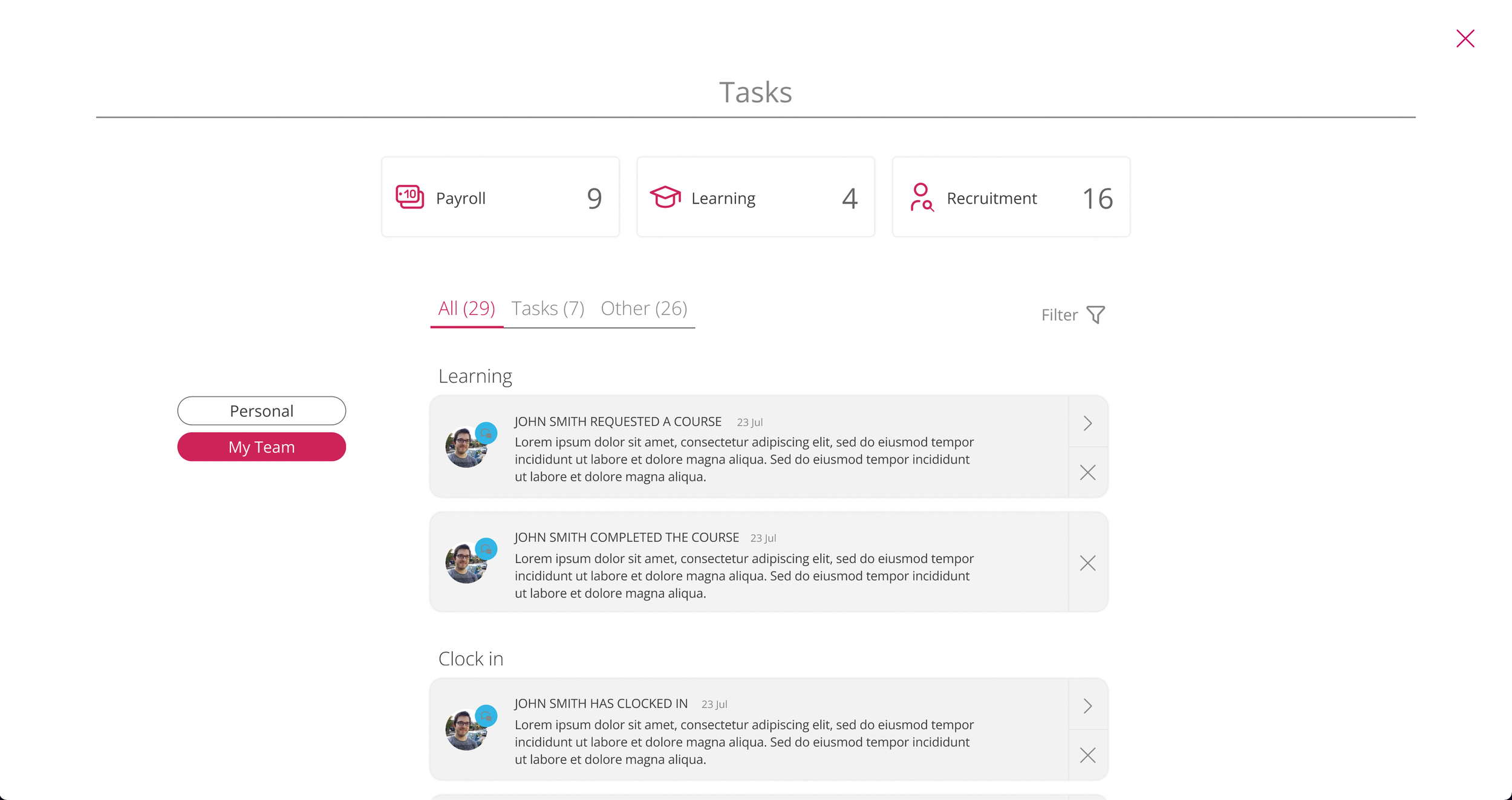
With the navigation, we were trying to enhance usability and ensure smooth interaction. We designed clear, streamlined menus that the user could access via the top navigation bar. These menus would slide in, taking up only a fraction of the page as an overlay. The left-hand menu was created with the idea of custom personalisation to give the user quick access points to their preferred tools within the app. This empowers users to tailor the navigation to their specific needs, improving efficiency and reducing cognitive load. The right-hand menu would keep the user informed about relevant active tasks, with the ability to view them at a personal or team level. This functionality would aid as a to-do list for not only an individual but the whole team, making sure nothing is missed and everything is accounted for.
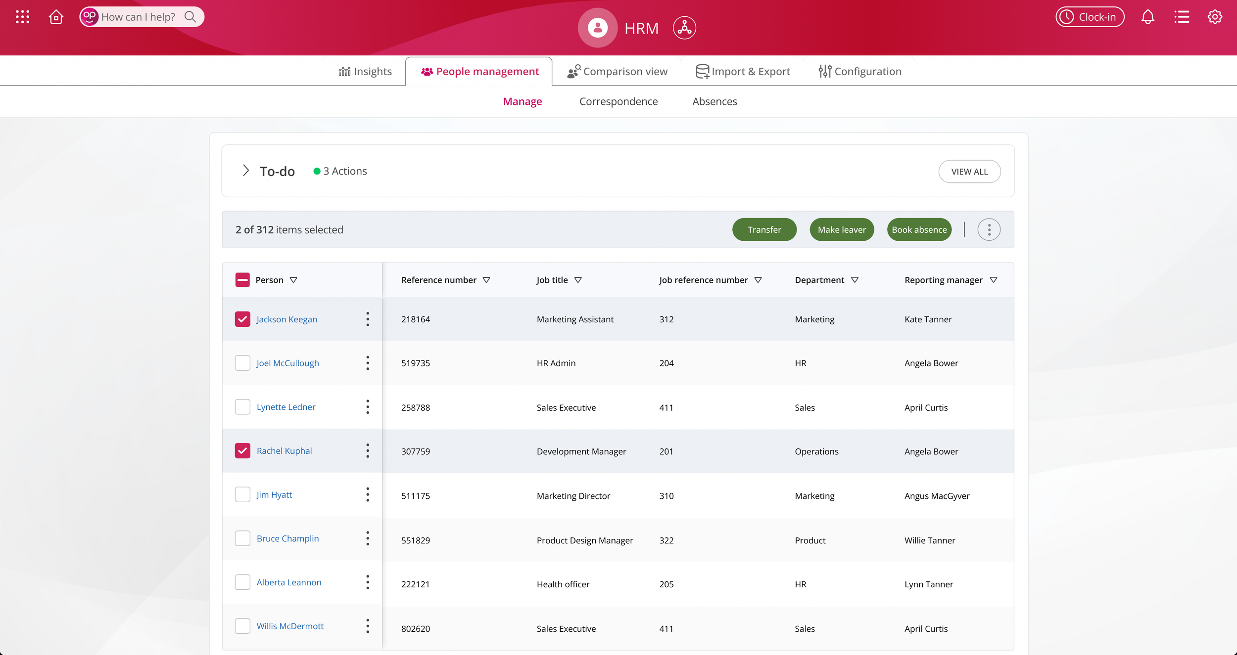
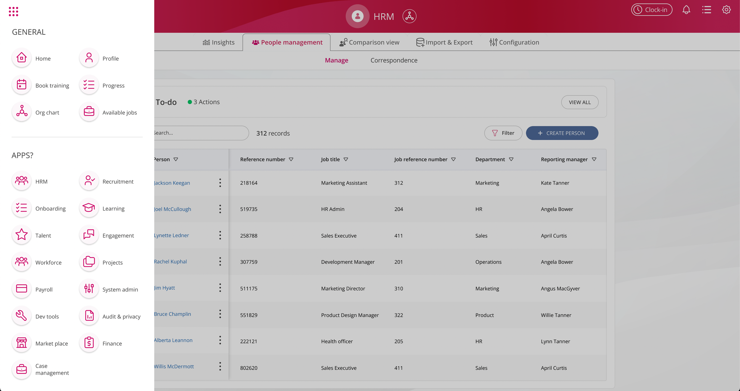
People & Task management
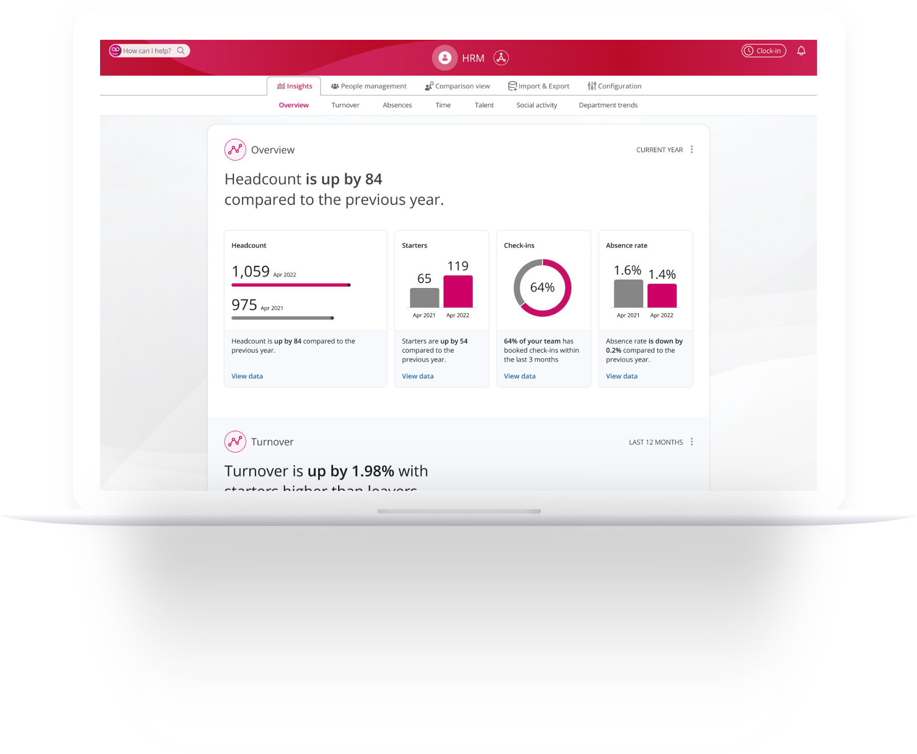
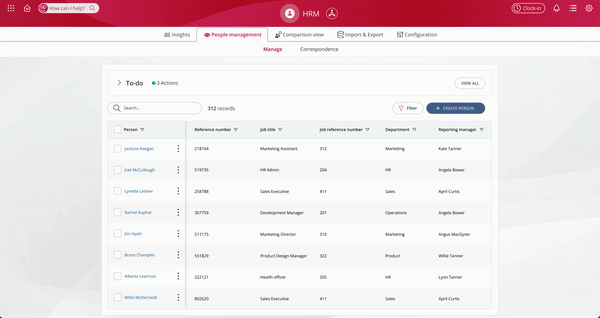
The task list was only the start of solving the people management issue that our users had brought up. The next phase was looking into how the users could actions some of these actions efficiently and with ease. The research revealed that most people management was done in Excel which prompted us to work with a spreadsheet table format. I effectively grouped and categorized data, used appropriate column headers, and implemented filtering options to allow users to quickly find and manipulate the information they needed.
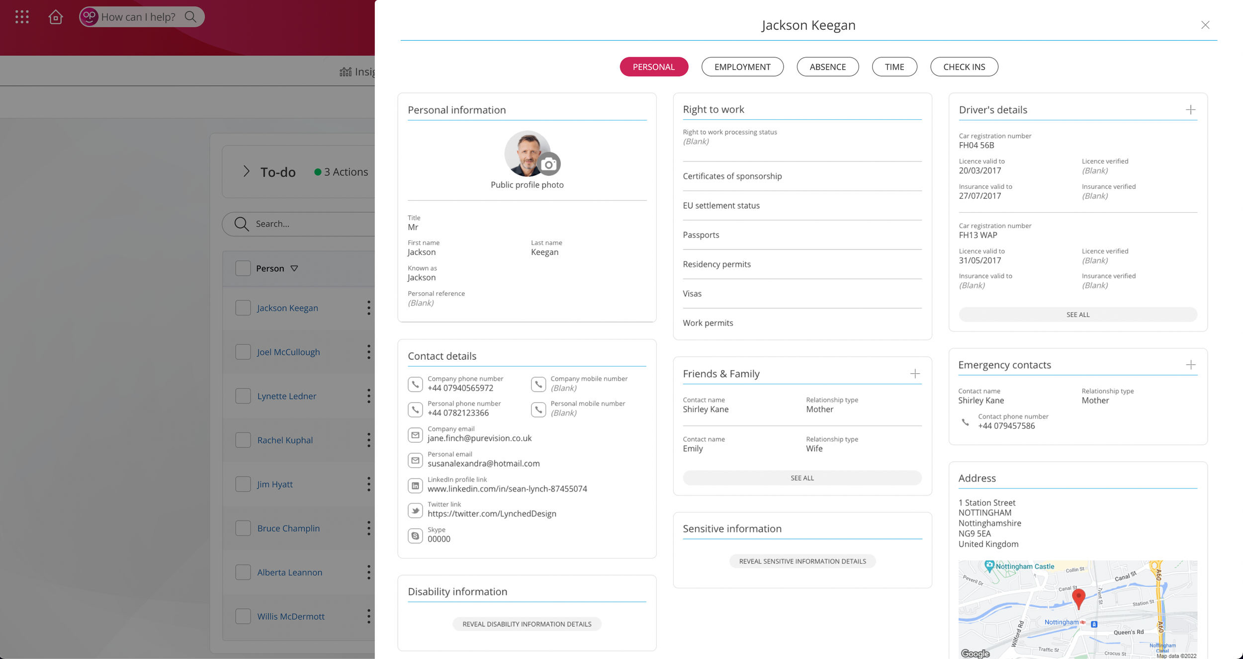
Our research also prompted us to add some enhancements that would optimise the admin's workflow. The key enhancements to the table were the To-do list, which would act s a reminder and set a task hierarchy for the HR admin, a Profile viewer which would allow the admin to quickly view an employee's full profile and status, Quick actions which were a set of the most frequently used actions by HR admins for People management, and group bookings which would allow Admins to make quick actions on whole departments without manually actioning each individual of a group.
More screens
Conclusion
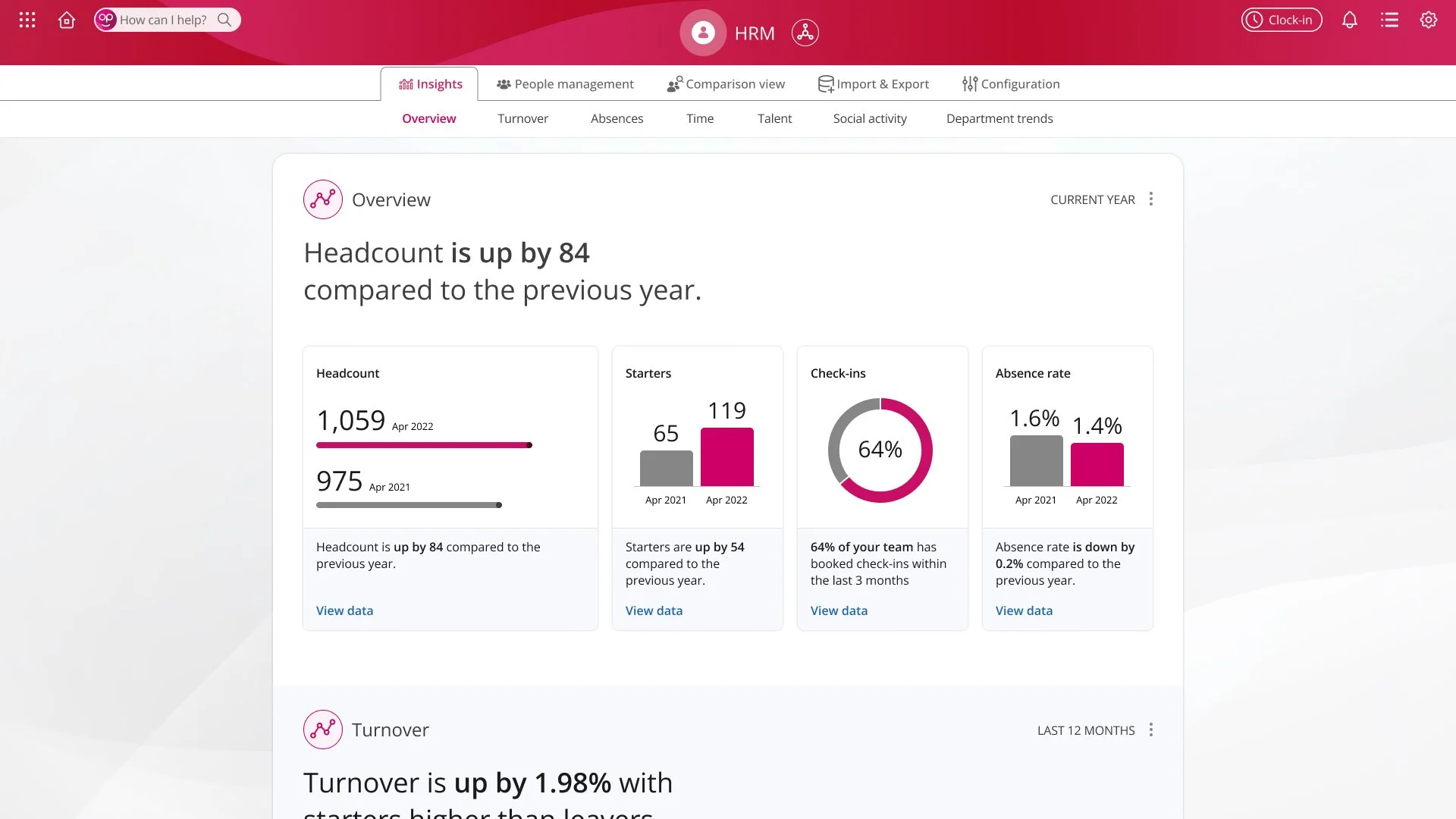
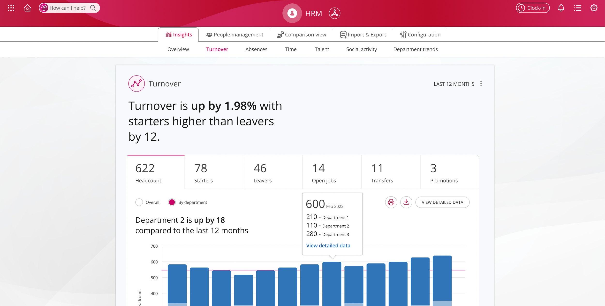
I embarked on an iterative design process, focusing on information architecture, task flows, and visual design. I crafted a streamlined navigation system that organised HR functions logically and reduced cognitive load for users. I also utilised data visualisation techniques to present employee data and performance metrics in an intuitive and visually appealing manner, making it easier for HR professionals to analyse and make informed decisions.
Reflect
This project allowed me to apply my UX design skills to solve real-world challenges, collaborate with cross-functional teams, and create a meaningful impact on HR professionals' day-to-day work. It reinforced the importance of user research, iterative design, and effective communication in delivering successful UX solutions. I am proud to have been a part of this project and to have contributed to enhancing the user experience in the realm of human resource management.
Challenges
One of the major challenges I faced was striking the right balance between robust functionality and a user-friendly interface. HR management involves handling complex data and intricate processes, so it was crucial to create a system that provided comprehensive features while maintaining simplicity and ease of use.